The challenge: coherence and indicator generation
Road casualty data is vast and heterogeneous. My first task was to ensure quality and methodological coherence—validating and cleaning the accident database so every indicator would be statistically sound.
Beyond counting events, I designed and calculated key metrics (fatality rates, exposure-to-risk rates, and association indicators between involved parties) to surface complex risk patterns by road user (cyclists, motorcyclists, pedestrians) and their factors. These insights drove focused prevention strategies.
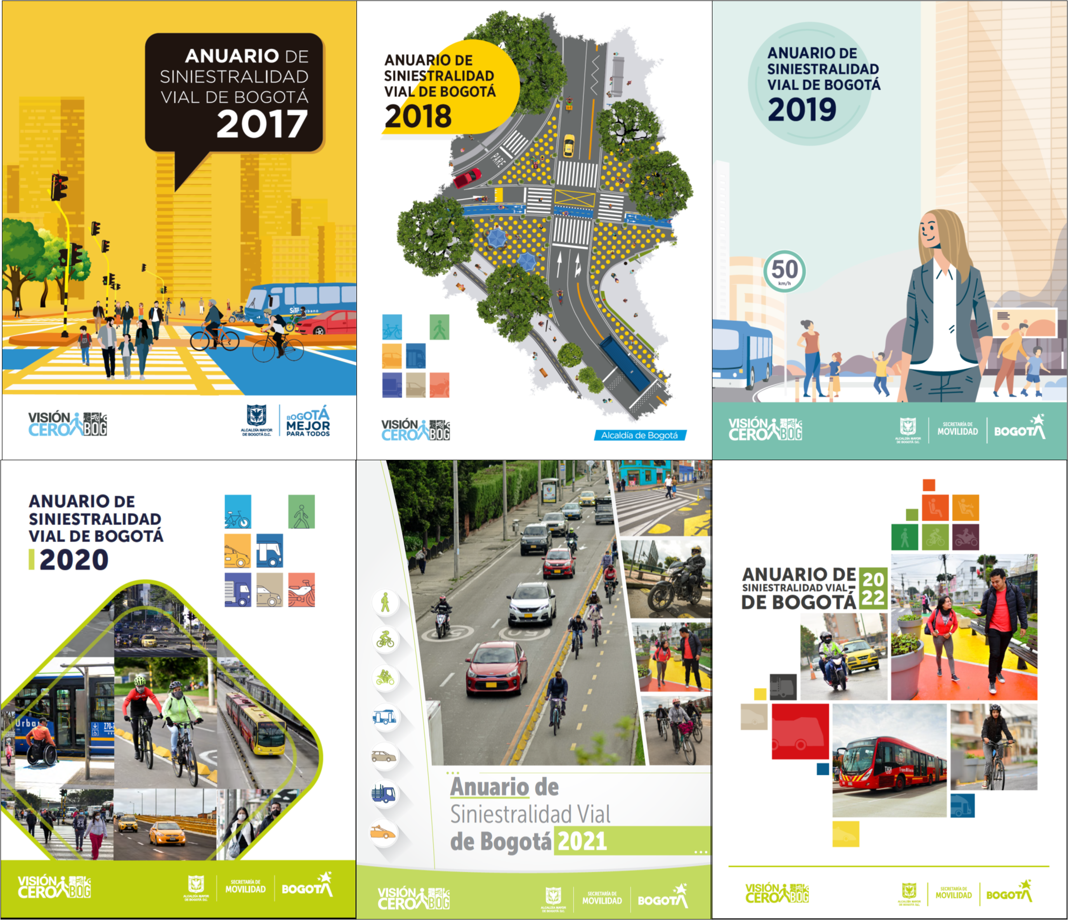
R and ggplot2: the visual narrative
The yearbook is a communication tool. Leveraging R and ggplot2, I designed and generated the visualizations that told a clear, rigorous story—highlighting mortality trends and high-risk areas so authorities and citizens could understand where and why lives were being lost.
Impact and legacy
The indicators and visuals became central evidence for planning and prioritizing road safety interventions in Bogotá. This work showed how advanced analytics supports Vision Zero and set a precedent for how the city tackles safety.